Hat on Top, Coat Below
« previous archives home notify list e-mail next »
Fonts Matter
December 22, 2018
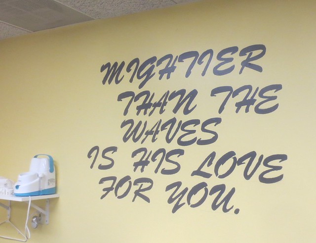
I am still not caught up with selecting photos from my November trip, but I’m far enough along to share the one below, which is a great example of a poor font choice. I came across it in one of the Sunday school rooms at the church adjacent to the hall where we celebrated Thanksgiving with cousins and friends and relatives of cousins. I have a college degree and know a lot of words, but it took some puzzling before I figured out the first word here is “mightier”. I don’t know what chance the little children in Sunday school have of reading it. This font is just not meant for an all caps application.
One good thing about this mural is that it led me to find Identifont which stepped me through questions about how various characters in the font are formed to try and tell me its name. The first time it narrowed down to one name, it guessed it was Brush 738. (It is not; the I among others is not a match, but since I didn’t know what a lot of the characters in the font look like, I’m not surprised.) The examples in the questions led me to look more carefully than I had and ponder all the variations in, for example, a capital Q. I also had fun clicking around to see a bunch of different fonts, most of which would have been better choices for this application.
On this date in 2017: Joiner
2016: Snapping Photos is Cheaper
2015: Who Are You Calling a Western Stubby?
2014: Bad Santa
2013: WDW Day 6: Magic Kingdom and a New Hotel
2012: Sock Monkey Summit
2011: Not Yet Socks
2010: Reversible Watch Cap
2009: In the Belly of the Beast
2008: Brain Clutter
2007: UFOs
2006: Tech Cat & Accretion is for Losers
2005: Spirit of the Season
2004: I’ve Been Working on the SQL
2003: Not a Weekly Check-In
2002: Planning

