The Manhole Quilt Saga
April 15, 2005
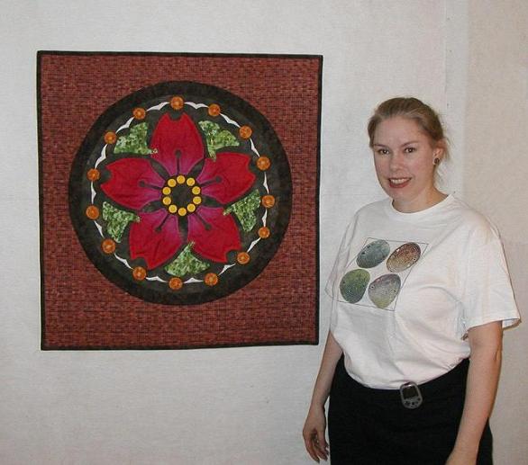
 Remember when I was soliciting votes in the manhole photo contest and promised to make a quilt to be given away to a lucky reader if I won? And then I won? And then barely mentioned the whole thing for almost three months? Well, as you can see in this picture, I finally finished the quilt. (And as you can see in this one, I wear my winner’s shirt with pride.)
The first step in making it was going to be making a pattern using one of the Shirley MacGregor books I mentioned in the entries linked above, but when I compared the image in the book to my photo, I saw they weren’t quite the same. Since I saw at least three versions of the Tokyo cover myself, that wasn’t all that surprising. I could have just gone ahead and used the book image to make my pattern, but I really wanted to use the design that won the photo contest, so I made my own. I enlarged the photo and printed it out, then outlined the edges of the main shapes with a Sharpie, leaving out a few details that I thought would be hard to render in fabric. I’d planned to scan the altered photo and somehow get rid of everything but the lines I’d just traced, but then noticed that the ink had bled through the paper and the back side had just the lines I wanted. After using Soft Scrub to get the ink stains off the kitchen table, I scanned the back side of the paper, enlarged that image until the circles in the middle were big enough for me to applique without suffering from ridiculous eyestrain, printed a pattern onto 12 sheets of paper and taped them together. After I was done, I realized that instead of having a pattern that matched the picture, I had one that was a reverse image, but since the cover was mostly symmetrical, I decided that was okay. I hadn’t decided how exactly I was going to transfer the pattern to fabric but figured I could work it out as I went along.
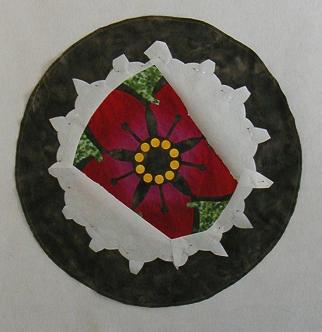
By this point, I had bought a mottled taupe-y brown fabric for the background of the cover and a vaguely Japanese print that I thought I might use for the backing and/or the background behind the cover, but other than that figured I could probably find what I needed in my stash. I started with the petals. Real blossoms aren’t all one color, so I looked through my stack of gradations and decided on part of one that shaded from red-violet to rose. Excellent; time to start sewing–I could pick the other fabrics later. When I’ve done applique before, I’ve usually traced the pattern onto the background fabric so I know where to place the pieces, but this background fabric so dark that I couldn’t see through it to trace. I thought about using dressmaker’s carbon paper and a tracing wheel to mark it, but I’d have to find the carbon paper and the wheel which I think I last used sometime in the late 80s and then I’d have to test how easy it was to remove the markings and why do all that when I could probably just eyeball it anyway. On to the petals–that fabric was a little on the dark side, too, so tracing through it from the pattern wasn’t going to work, but I could see the pattern through freezer paper just fine, so I traced the petal shapes onto that, cut them out, and ironed the freezer paper to the right side of the petal fabric. I put the first one down on the background in what looked like a reasonable place and sewed it down, using two different colors of thread to blend with the changing colors in the fabric. For each petal after the first, I figured out where to put them by laying them all out to make sure I was spacing them okay and then pinning the one I wanted to work on next, as shown here. (That little bite out of the side of the background fabric is there because I somehow managed to sew through two layers of background without noticing until I was done with the petal. Instead of ripping out the applique, I carefully cut the extra layer away from the back. Good thing it was near the edge.)
After the petals, I moved on to the gingko leaves, using the same freezer paper approach as for the petals. After I got the first one done, I decided I didn’t like the fabric I’d chosen and started over with a different green from my stash. That one looked much better and the leaves went on pretty quickly. I managed to put the second one I did in the wrong place according to the pattern but just let it be–as long as there was a leaf between each two petals, I figured it was okay. After the leaves, I decided to do the little circles in the middle. I picked a pollen-y yellow for them and pulled Gabrielle Swain’s Applique in Bloom out of my bookshelf to get advice. That’s where I got the idea to use cardstock templates. I happened to have some very nice white cardstock handy in my small but growing collection of scrapbook supplies–seems a bit ironic that the first time I used some of them it was to make a quilt. I traced a nickel to make the templates because it was about the right size and gathered the yellow fabric around them before sewing it down. To keep them spaced somewhat reasonably, I sewed on every other one and then went back and filled in. (In progress photo here.) Gabrielle’s book said it was probably best to leave the templates in small circles rather than slitting the background and removing them, so I left them. That prevented the turn-under from showing against the dark background, too. I don’t think the cardstock will hold up to washing but since this is a quilt to be hung on the wall rather than handled, I figure it will be years before anyone has to deal with it.
I got a little bit stuck after the circles. I didn’t know if I should do the seagulls or the outer ring next. After pondering for a while, I decided on the outer ring, so I’d know how much room I had to fill with the seagulls, and also because I had an idea how to do the ring but hadn’t worked out the seagull bit. My vision was that I’d make the ring by folding the background fabric in to reveal the back side; it would be just enough contrast to mark the edge of the manhole cover but not so much to highlight any placement errors that had crept in during construction. I dusted off the beam compass that Mr. Karen had bought me years ago after being horrified by the string and pencil method I was using to mark big arcs on a quilt top I was working on back then and marked a circle for the ring, then trimmed the background around it. As soon as I laid it on the counter and started turning under the edge, I realized my vision was flawed–for a narrow ring, it might have worked, but for the wider one I needed, it wouldn’t, at least not without some serious gathering and coaxing and fussing and even then I didn’t think it would ever lay flat. Okay, making up Plan B–I’d applique a separate ring on later. Time to figure out the seagulls.
I picked white Fairy Frost for the seagulls after pondering some light greys. Mostly because I didn’t want to have the turn-under show against the dark background but also because there were those narrow points to deal with, I decided to use reverse applique for this part. (That’s where the background is cut away to reveal the shape rather than the shape being applied to the background.) Making a template for each seagull wouldn’t really work, so I traced the bottom part of the seagull ring onto freezer paper, having to use a few pieces of it because the ring was wider than my roll of paper. When I went to join the pieces and iron them to the quilt in progress, I found the center part I’d sewed was enough off from the center part of the pattern that the ring pieces wouldn’t meet. Solution? Bonus seagull. On the day I did this part, Erica came over and was very, very skeptical that I knew what I was doing when she saw it in this state.
As I worked on the first seagull, I wondered if Erica was right to be skeptical. The bottom half of the bird went okay, but when it came time to do the top, I was stumped. I couldn’t figure out how to make the ends of the wings pointy without leaving raw edges showing (and ripe for fraying). After more pondering, I hit on the idea of doing all the bottoms first and then using a separate piece of background fabric to complete the top of the wing shapes. I didn’t have a single piece of the Fairy Frost big enough to layer behind, so I used several pieces. I think that’s allowed by the applique police, but I’m not 100% sure. It looked a little odd when I was done with the bottoms and my formerly round piece was all irregular, but I trusted it would all work out.
I was glad I’d bought the background recently, because I needed to buy more to have enough to layer over the top to finish the seagulls. It was rather cool to see them emerge out of the sea of brown as I worked. I got better at the curves of the wings as I went along and was tempted to redo some of them after I finished them all but decided to leave them alone. Irregular shapes add character, I reasoned. (Also, I’m lazy sometimes.)
Seagulls flying, it was time to do the doughnuts between them. I know the designer of the manhole cover did not intend for those round shapes with the hole in the middle to represent doughnuts, but that’s what they became in my mind. I didn’t really relish the idea of having to applique both the inside circle and the outside one to make these shapes, so I decided to use yo-yos. I’d never made any before, but it didn’t seem like they’d be that hard. I auditioned a few orange and gold fabrics before deciding on one and used the top of a Coca-Cola glass to cut the circles of fabric. Usually yo-yos are gathered so there’s only a small opening left, but I figured if I left a larger space that would echo the shapes on the manhole cover better. I varied the size of the yo-yos some because the spaces between the seagulls weren’t consistent, and that worked out pretty well.
Once the yo-yos were on, I got back to the outer ring, which I ended up doing in a brown print that was only slightly darker than the background. I did the inner part of the ring and then had to decide what to sew it onto. While in a shop to buy thread for the applique, I’d seen one of these Postcards from Japan patterns and liked the split background, so I started with that idea. I played with different fabric combinations, some of which looked okay, but eventually settled on a single fabric with bricks on it. The manhole cover that inspired this project was set in brick, so that connection appealed to me. I ended up using the wrong side of the fabric facing out, as doing it that way muted what I felt were distracting white highlights on the right side.
To start the quilting, I stitched in the ditch on both sides of the outer ring to stabilize the piece, then I amused myself by doing a big brick pattern on the background. I used matching rayon thread to outline the leaves and petals about a quarter-inch in from their edges, then decided to add a bit of shimmer with opalescent sliver thread on the leaves, starting with the stem and going inside the outline I’d done in rayon. (This picture doesn’t really do it justice; it’s very pretty stuff, the sliver. . I really with they’d called it “tinsel”, though, since “sliver” is too close to “silver”. Pity the person who has to order silver sliver thread over the phone.) I stippled the background of the manhole cover with brown silk thread, which nicely disguised the ripples I’d created when I hadn’t made sure the piece was completely flat before I appliqued it to the background. (You can see the quilting pretty well in this shot.)
I used the French twist binding technique. That way, I didn’t have to do a separate hanging sleeve and also the width on the back covered the spot where I didn’t leave quite enough backing fabric to cover the batting (I noticed that mistake before I started quilting, but was leaning toward this binding method anyway and didn’t want to take the time to take out the basting and re-align the layers.) It’s pretty neat–a rod just slips right in. (Notice the cherry blossom backing fabric–I thought that was a nice touch, if I do say so myself.)
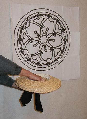
I couldn’t do the label until I knew whose quilt it was, so I put the names of the people in the drawing into an actual hat and Mr. Karen mixed them up and pulled one out. (That’s the pattern on the wall behind the hat.) Amanda was the lucky winner. One might suspect she bribed him with exotic and tasty Australian foodstuffs, but I know that was not the case–I would have smelled the TimTams on his breath for sure.
I felt sad that not everyone could win, so in the follow-up e-mails I sent to the drawing entrants, I offered to send one of the magnets I’d decided to make. They use the same backing fabric and the borders on the magnet are the same as the binding on the big quilt. The leftovers will probably turn into JournalCon swag at some point, possibly as early as this fall in San Diego if I’m able to go this year.
Thus ends the telling of the story of the manhole quilt. Next up, a baby quilt for a little boy who is already here in the world. His dad is a devoted University of Michigan fan and I’m considering whether it would be too mean to sneak some Michigan State fabric into the quilt just to tease him.
One year ago today, I shared thoughts about Pikachu pedometers. In the 367 days since I turned on this current one, I’ve walked 2,187,367 steps wearing it. At least that’s what Pikachu thinks, since he can’t tell the difference between walking and standing in place and jiggling. I guess it all burns calories.
Two years ago, there was no entry.
Three years ago, it was very warm outside. Not this year. It is at least sort of sunny.